Logo Recreation
& Brandguideline
The goal of this project was to take an already existing logo and to redesign it and create a brand guideline for the logo.
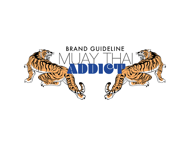
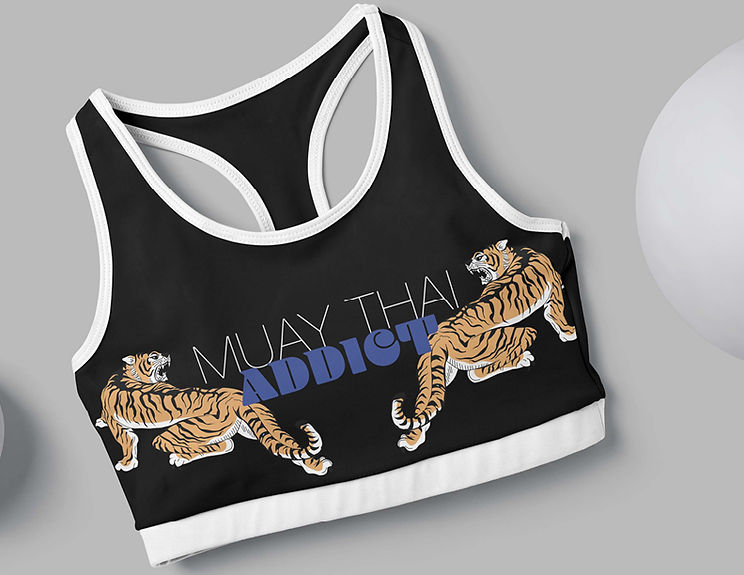
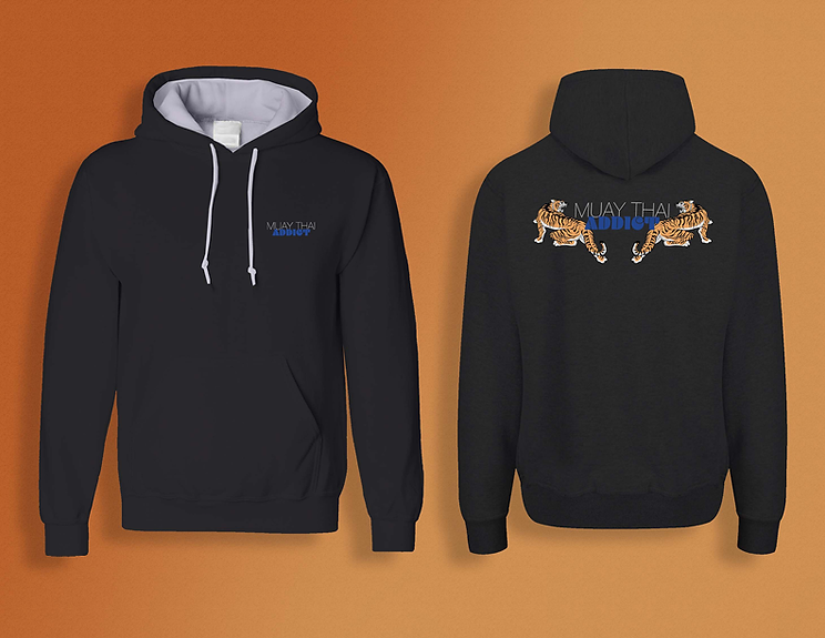
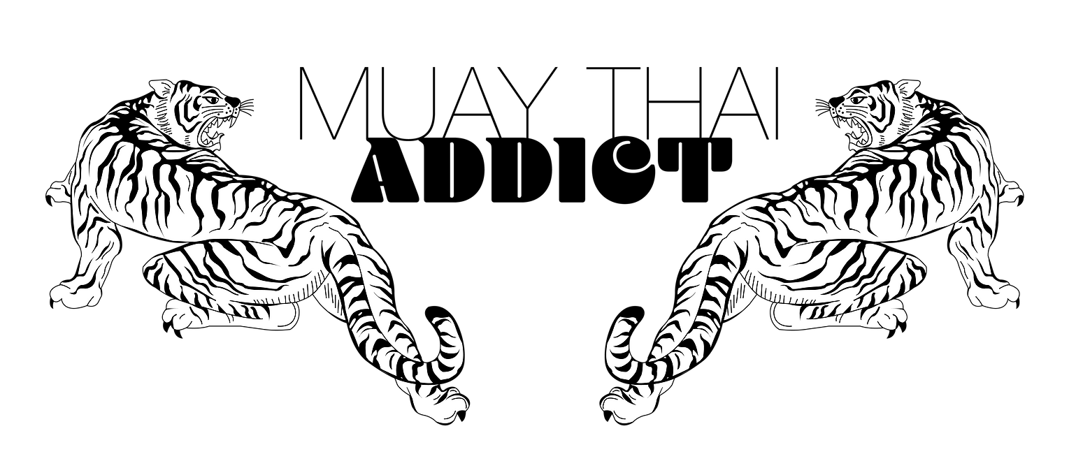
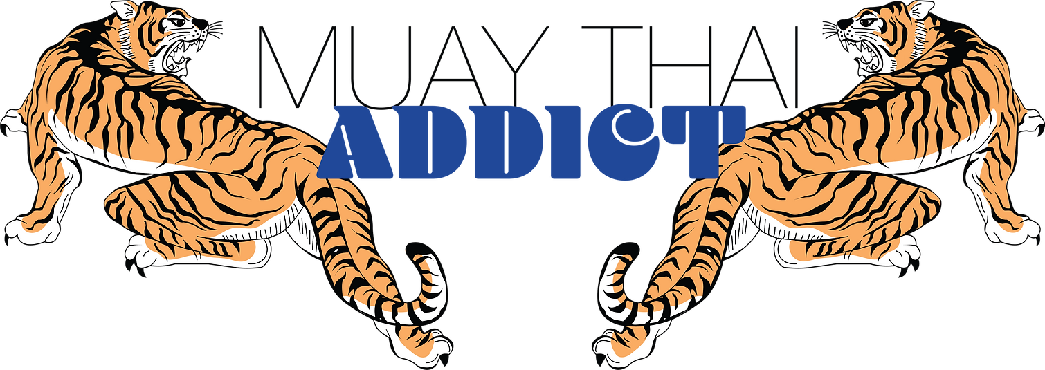
I redesigned the logo for the American company Muay Thai Addict.
When designing a logo it is important to start with a logo brief.
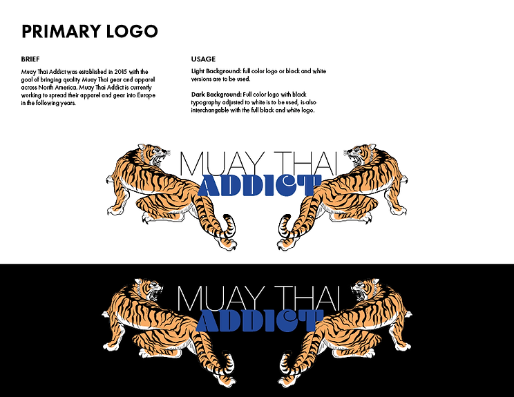
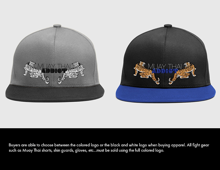
The Muay Thai Addict company is relatively new and is focused in the United States, Canada, and North America in general. The company was founded due to a lack of quality Muay Thai apparel and gear across North America. They are working this year and into next to bring their events and products to Europe.
The company was only founded in 2015 in Florida. As such they don’t have much of a history when it comes to their logo. They only have the one design that has been getting used since 2015 and has yet to be rebranded.
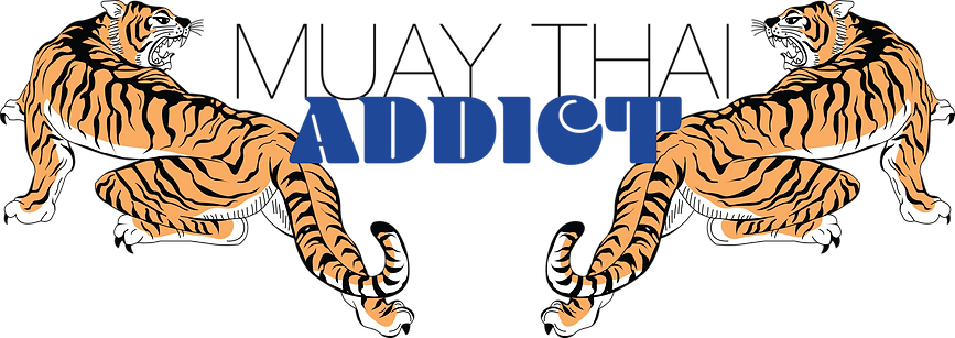
While I am not able to find information on why they designed the logo the way that they did from my knowledge of the lifestyle, martial art and culture I can tell that the typography is meant to be reminiscent of Thailand’s language and writing (the founders of the martial art Muay Thai Boxing). The design of the fighter is also important because Muay Thai is “the art of the eight limbs.” So, the design is meant to show the fist, elbow, leg, and knee strikes which is why in most Muay Thai designs you will always see the fighter with a raised leg as though to knee or strike with a kick instead of just the fighter in a fight stance.
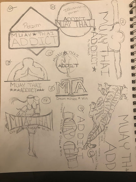
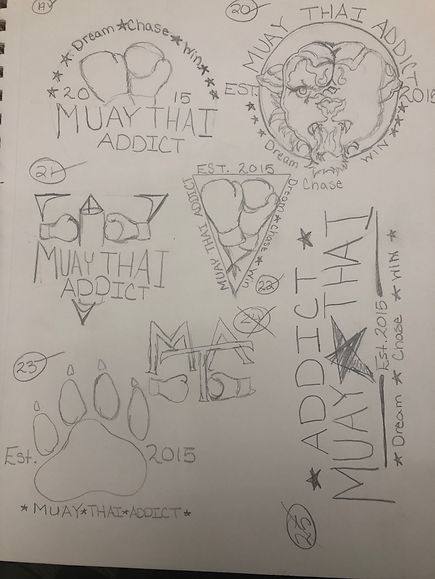
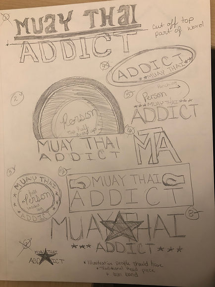
The next step in the process to sketch out as
many different rough drafts for a logo
as you are able.
After rough ideas and concepts are jotted down, I moved on to creating my favorite of the logos in Illustrator.
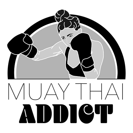
Once the best concept ideas are done, the company and designer work to select the best logo and created a finished logo.
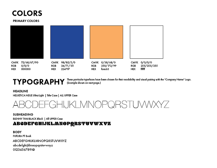
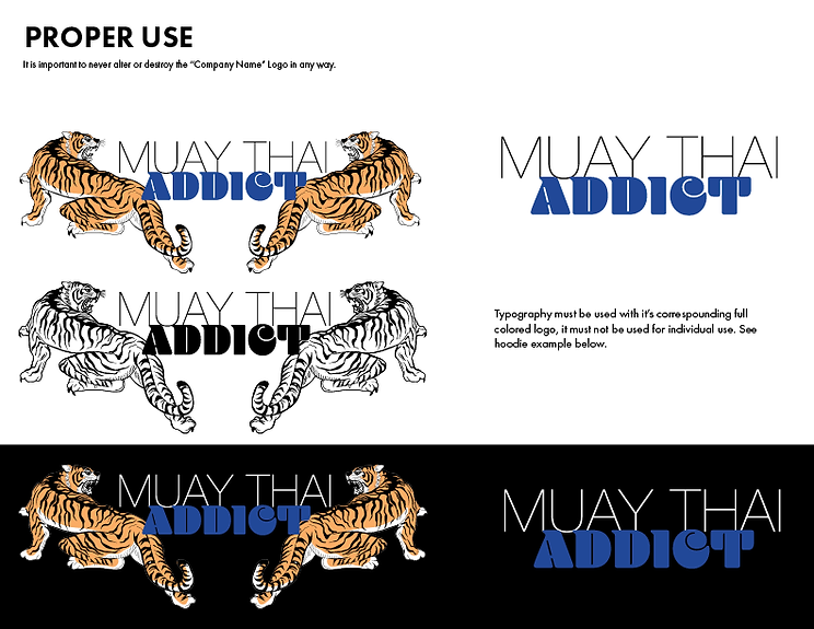
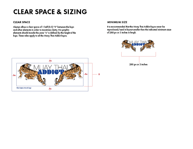
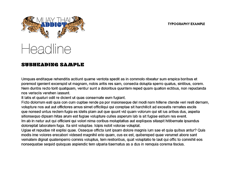
The final step of a logo recreation is building the brand guideline.